
It's hard to believe that two years ago we were getting our teeth into the first playtest packet for what was once referred to as D&D Next. Now Wizards of the Coast has finally revealed the covers of the first line of books in the new edition, and the community has been going to town on the design, so I thought I would throw in my two pence.


The first thing I noticed is that we officially have a title, and it's not D&D Next. No, instead it's quite simply 'Dungeons & Dragons' complete with the fire-breathing ampersand from days gone by. Great, I like simple. But what about the books themselves?
Ok, so they seem to have gone for a very striking visual style, one with minimalist typography and a whopping great action image on each book. To be fair, all the artwork is good, from the huge green dragon on the Starter Set to the Beholder carnage on the Monster Manual. However, is it me or does it all seem a bit...overwrought? There's no doubt that these are really lovely pieces of art, but they are terribly glossy to the point they look almost 3D. I don't know about you, but when I heard Wizards were hearkening back to the days of yore with the rules, I would have expected something a little more traditional.
I'm going to just come out and say it. There's something 'off' about the typography. It just gets drowned out by the super huge artwork and ends up mewing the brand rather than bellowing it from the rooftops. Come on guys, you're D&D! The oldest roleplaying game in the world. Your branding should boast that fact and make a huge impression. In fact, the full title just hangs around on the bottom left, sticking out awkwardly.
I have a feeling of meh about these. I think the artwork is super cool and clearly some huge effort has gone into rendering it, so kudos, but the overall design seems way too feeble.
But there's one other reason I think these designs don't really hold up. They don't represent D&D. Not in my mind anyway, you might have a different opinion. If you look at these, you would think that D&D is just GIANT MONSTERS ATTACKING WARRIORS. DEATH, DEATH, KILL, KILL. But in reality, isn't D&D more than that? Isn't it exploring a mysterious forest? Isn't it creeping through a tomb trying to grab an artefact without setting off a trap? Isn't it planning the next adventure in a candle-lit tavern filled with different races? Surely it's more than battle, which these covers would lead you to believe. Look at the 4th edition DM's Guide as a comparison.

It's a big damned dragon, but what is that it's guarding? What mysteries lie within? It's quite subtle and works well to evoke a mood. How about AD&D?

No violence at all. Instead we, the viewer, are greeted by a strange cloaked figure. Where are we going? Who is he? We want to know more. We want to enter through those doors.
And of course, the classic Player's Handbook cover...
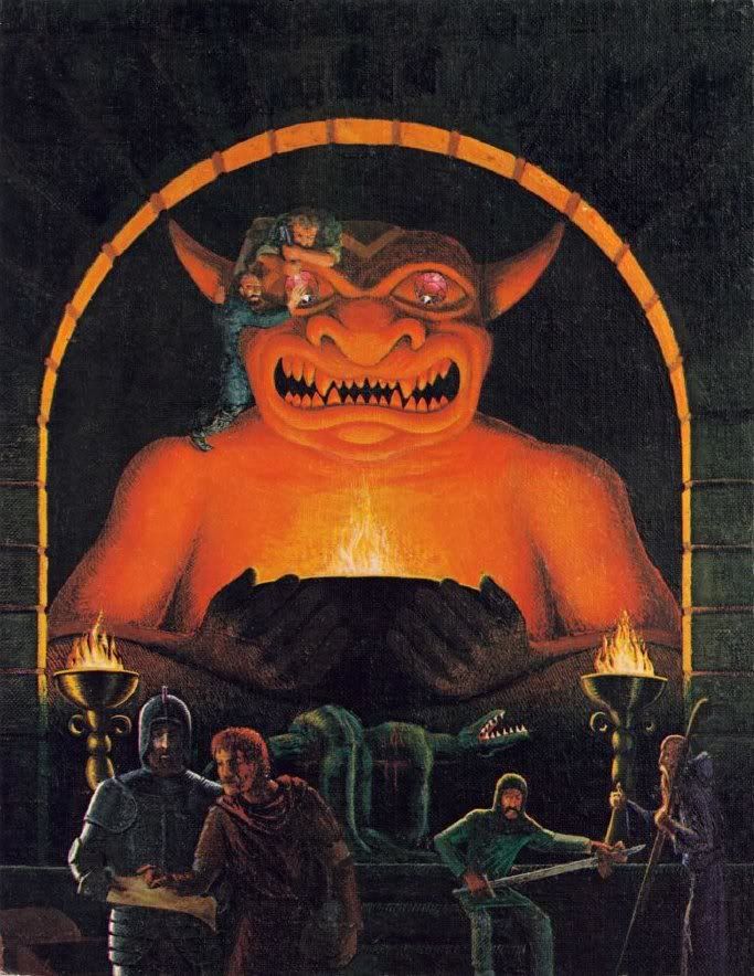
This says D&D. Thieves trying to prize gems from a demonic statue. A warrior polishing his sword in his downtime. Two adventurers trying to find a way through this mysterious dungeon. To me, this is far more evocative than any of the new designs.
It's a matter of taste - you might absolutely love the new designs, which is fantastic. A lot of work has gone into creating them and I don't want to completely write them off, but honestly, I can't say that this is D&D for me.
No comments:
Post a Comment